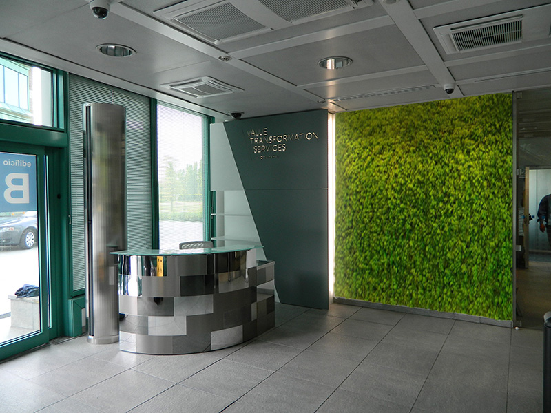
VTS – HEADQUARTER LOBBY
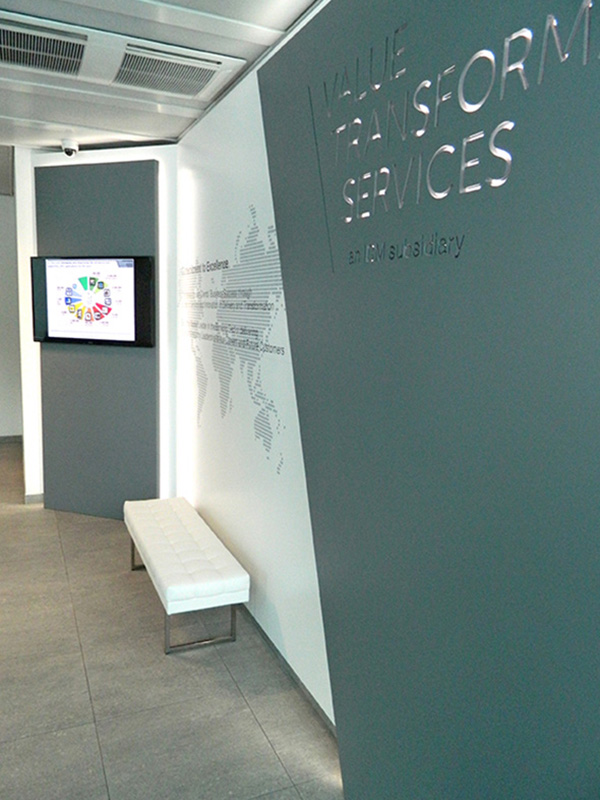
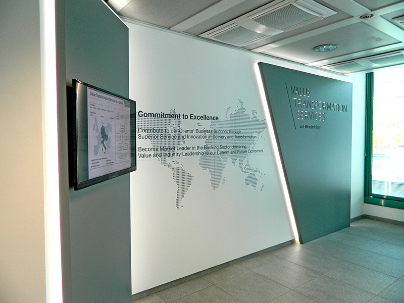
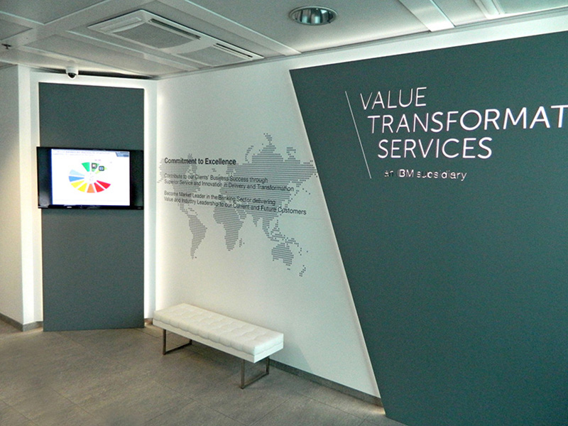
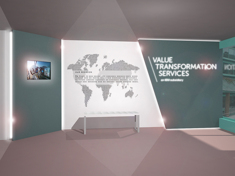
A simple code of aesthetics was implemented to create and effective entrance to the company born form IBM and UNICREDIT. A simple use of diagonal lines and two colours, along with rear-lighted panels, highlights the name and brand of the company as well as their main message. Logo as a generating matrix.
CLIENT
G.P.JOHNSON - E&E
ADDRESS
Segrate (MI), Italy
DATE
2014
Category
Interior Design


